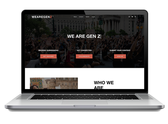
Your website is your most important marketing tool. We’ve talked about why your digital presence has to be on point, but now we want to show you the magic that actually happens with a nonprofit website redesign. Let’s take a look at 5 recent redesigns Mittun created.
But first how do you know if you need a new website? And how do you move forward with a clear plan? Your team should ask:
Arab.org
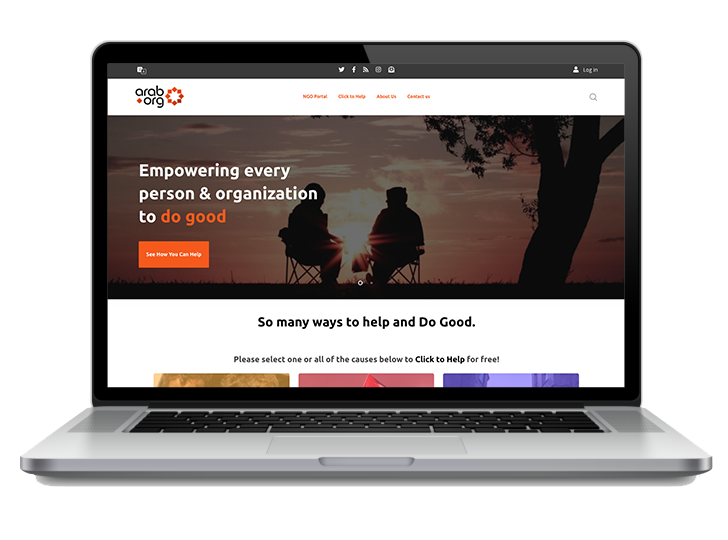
Arab.org is on a mission to improve the status and welfare of people in the Arab World and beyond. They provide information, offer opportunities to connect, and campaign for issues.
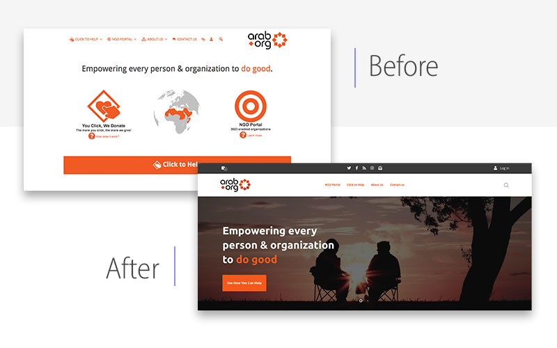
Before:
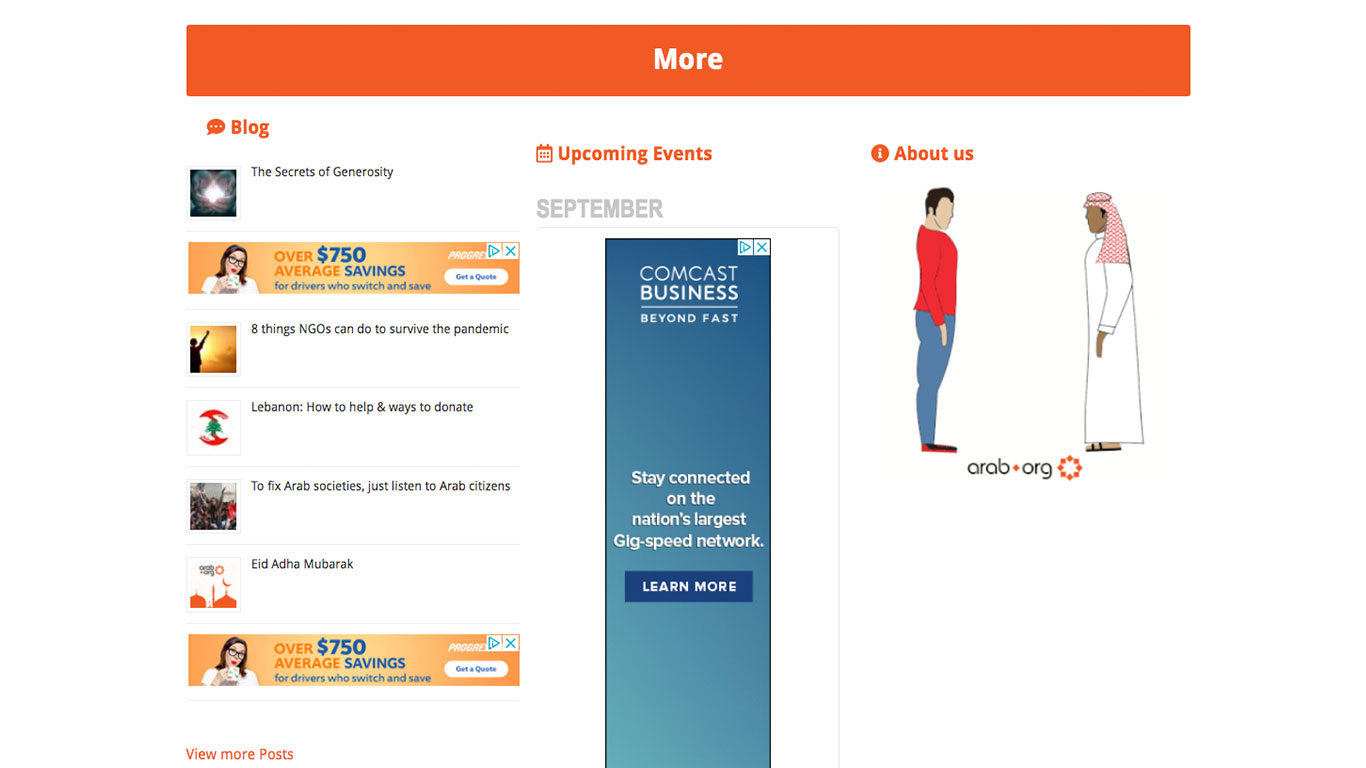
The idea behind the mission is inspiring and pointed, but the website before the redesign didn’t reflect their professional and deliberate practices. The inconsistent navigation and call-to-actions caused the site to be less efficient. Also, the disruptive ads and lack of content made them appear less credible to those unfamiliar with the organization.
After:
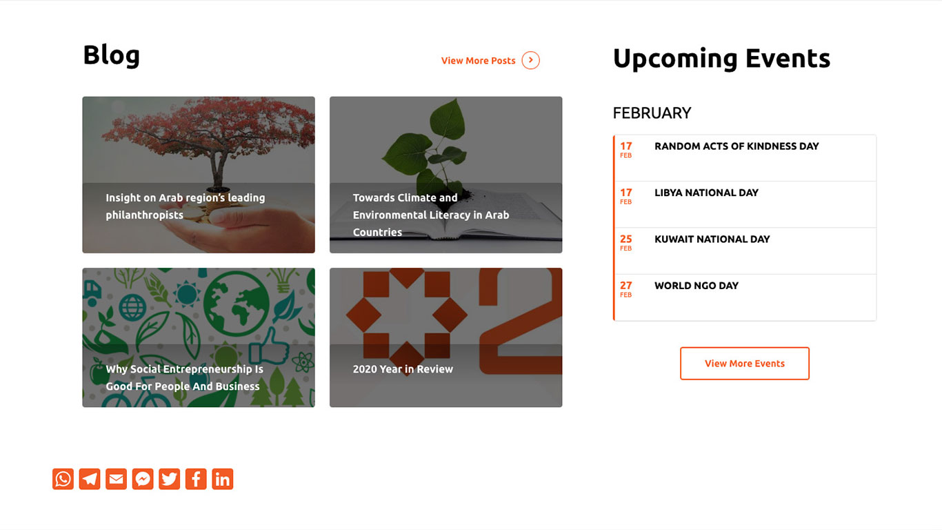
The nonprofit website redesign created an authentic and genuine place for information on the Arab community. It positioned the organization as the largest community for doing good, and their web persona now matched the professional and important work they are doing. It is easy to follow, accessible to all and promotes long-term engagement. By educating and informing younger generations, their impact is even more widespread.
In addition, the redesign improved the speed of the site and focused on being mobile-friendly. Both are absolute necessities in 2021.
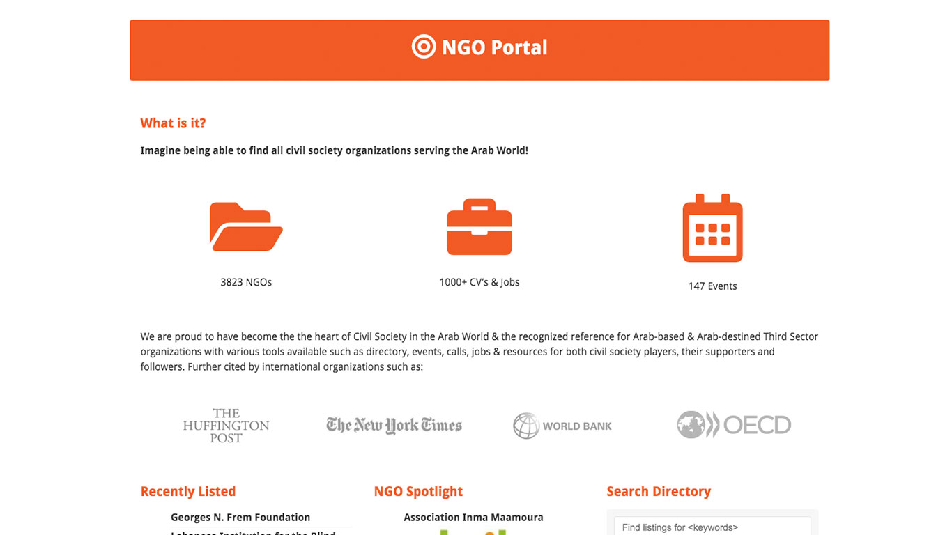
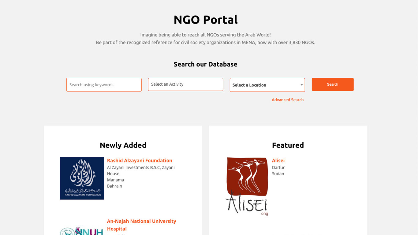
NGO PORTAL
Before | After
EVENTS
Before | After
Child Apraxia Treatment
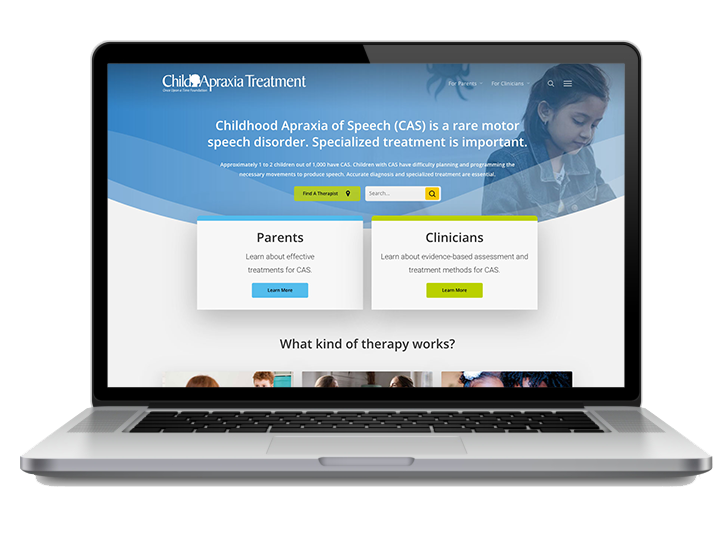
Child Apraxia Treatment provides resources to parents and clinicians on evidence-based assessment and treatment of this rare speech disorder.
Before:
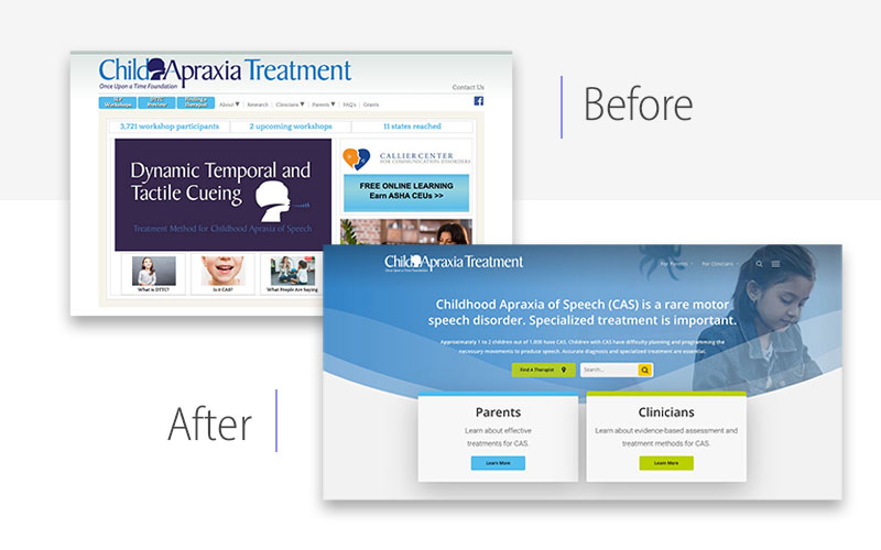
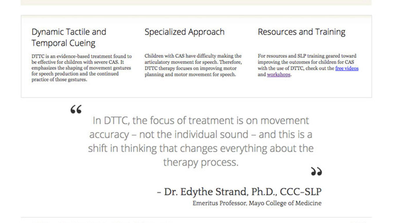
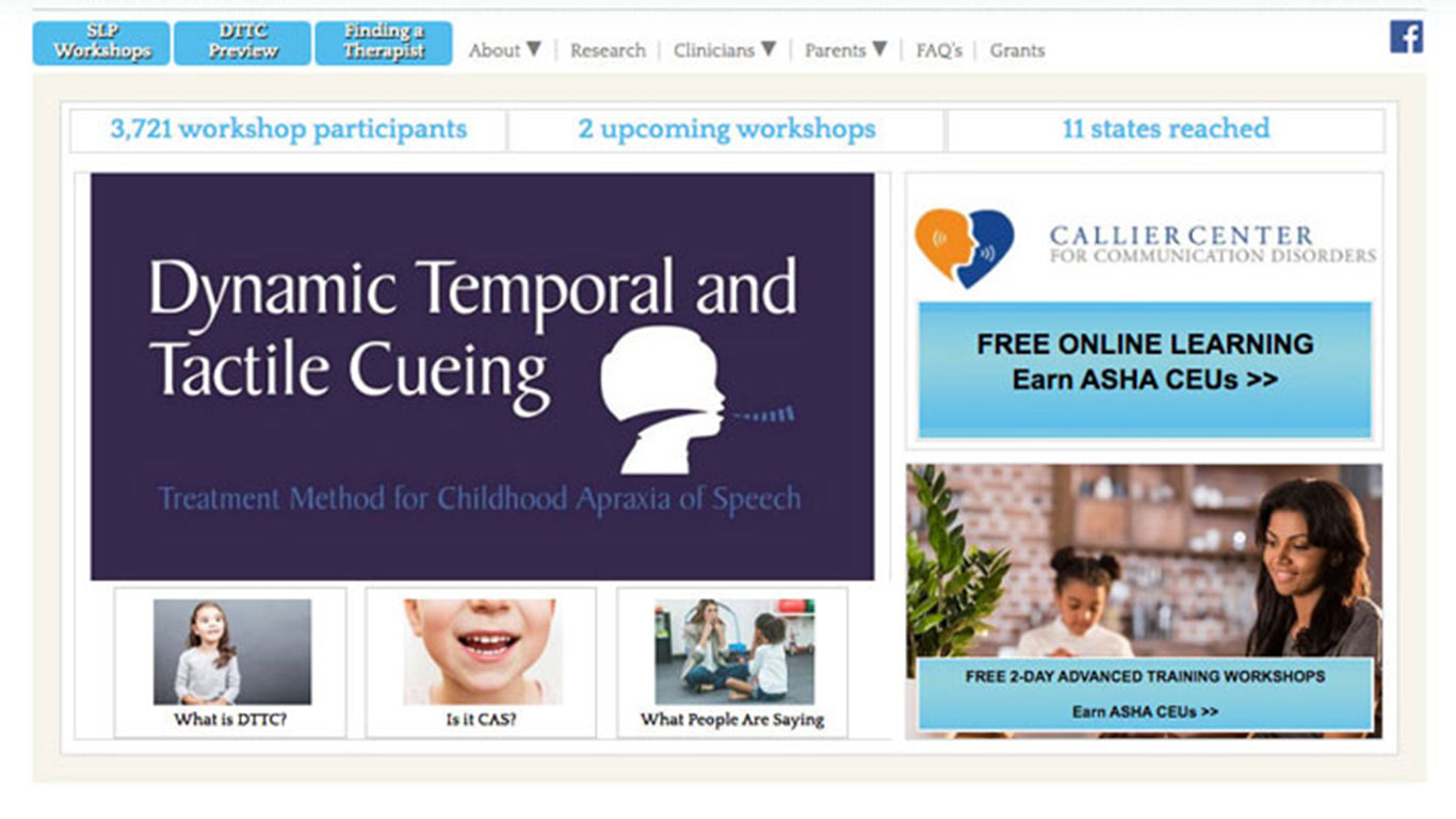
Sometimes a site is just old. Child Apraxia Treatment’s previous site was outdated. It was too heavy on text with a lot of redundant links. That may have been intentional when the site was originally built, but as trends and Google rules change, outdated strategies can actually hurt SEO.
Another big backend knock against the site was that the staff was not trained on how to make changes themselves. They had to wait on IT every time they needed something updated.
After:
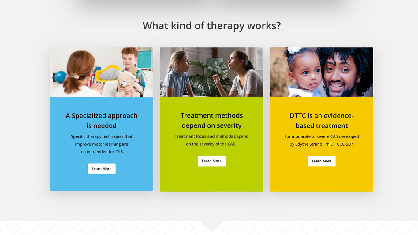
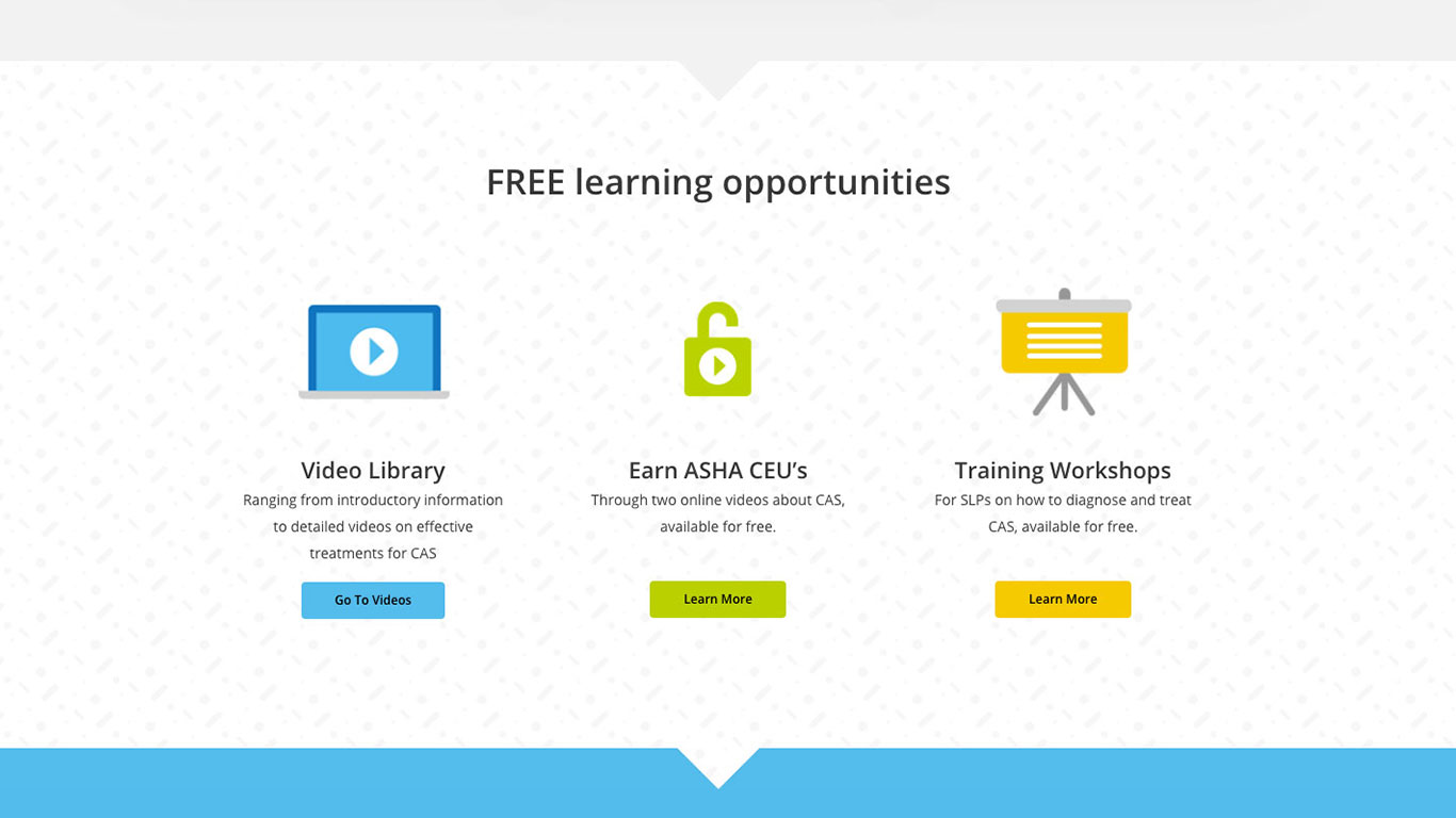
Ah, isn’t that refreshing? The new site is far more visually appealing, and the organization of the site makes it easier for speech language pathologists and parents to quickly find the information they need. And it wasn’t long before their SEO increased, driving more quality traffic to their new site.
THERAPY OPTIONS
Before | After
LEARNING OPPORTUNITIES
Before | After
Eryc Taylor Dance Outreach
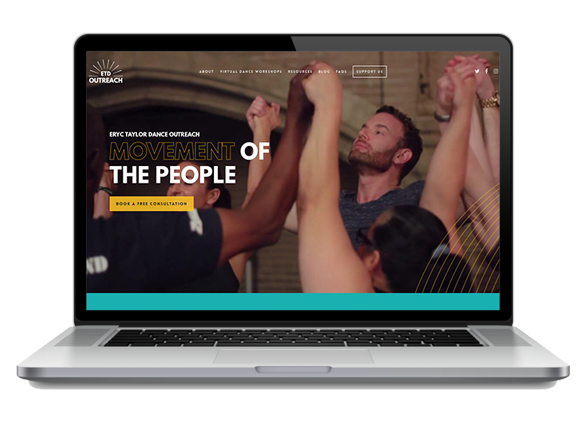
Eryc Taylor Dance Outreach is a NYC-based organization with a mission to create positive social change by using dance as a tool to inspire and heal.
Before:
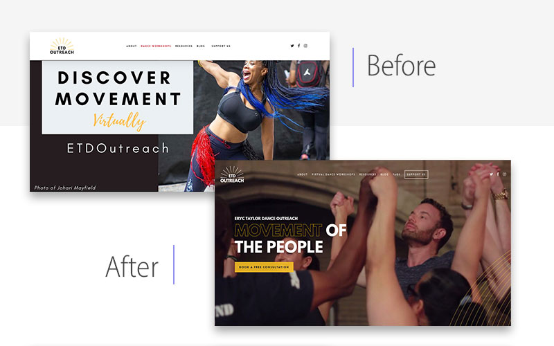
Sometimes our clients don’t come to us with goals; they come to us with crisis. Eryc Taylor Dance Outreach had lost much of their old site, so we did that whole lemons into lemonade thing.
After:
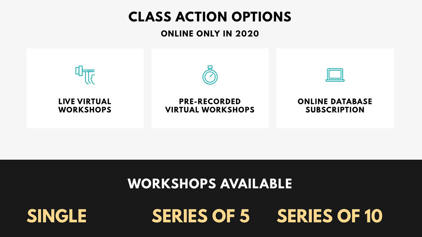
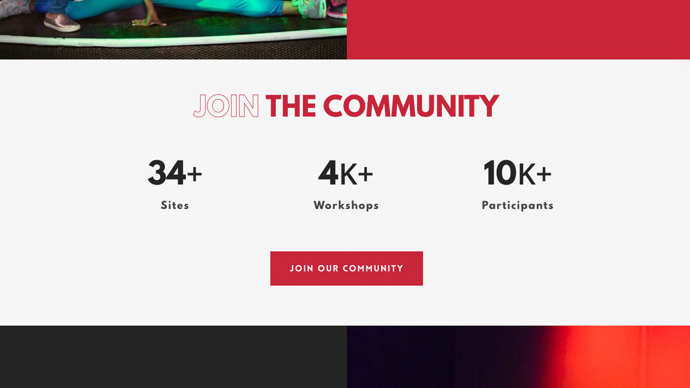
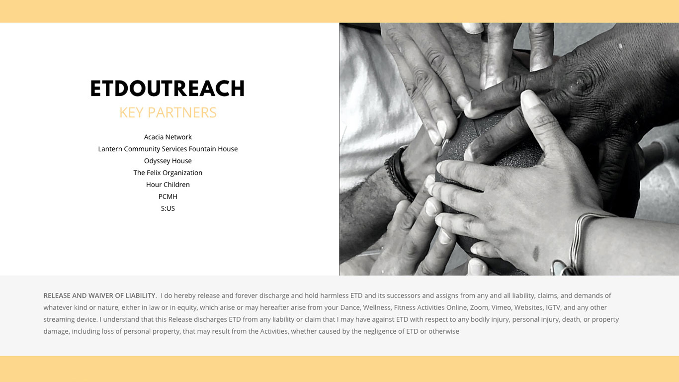
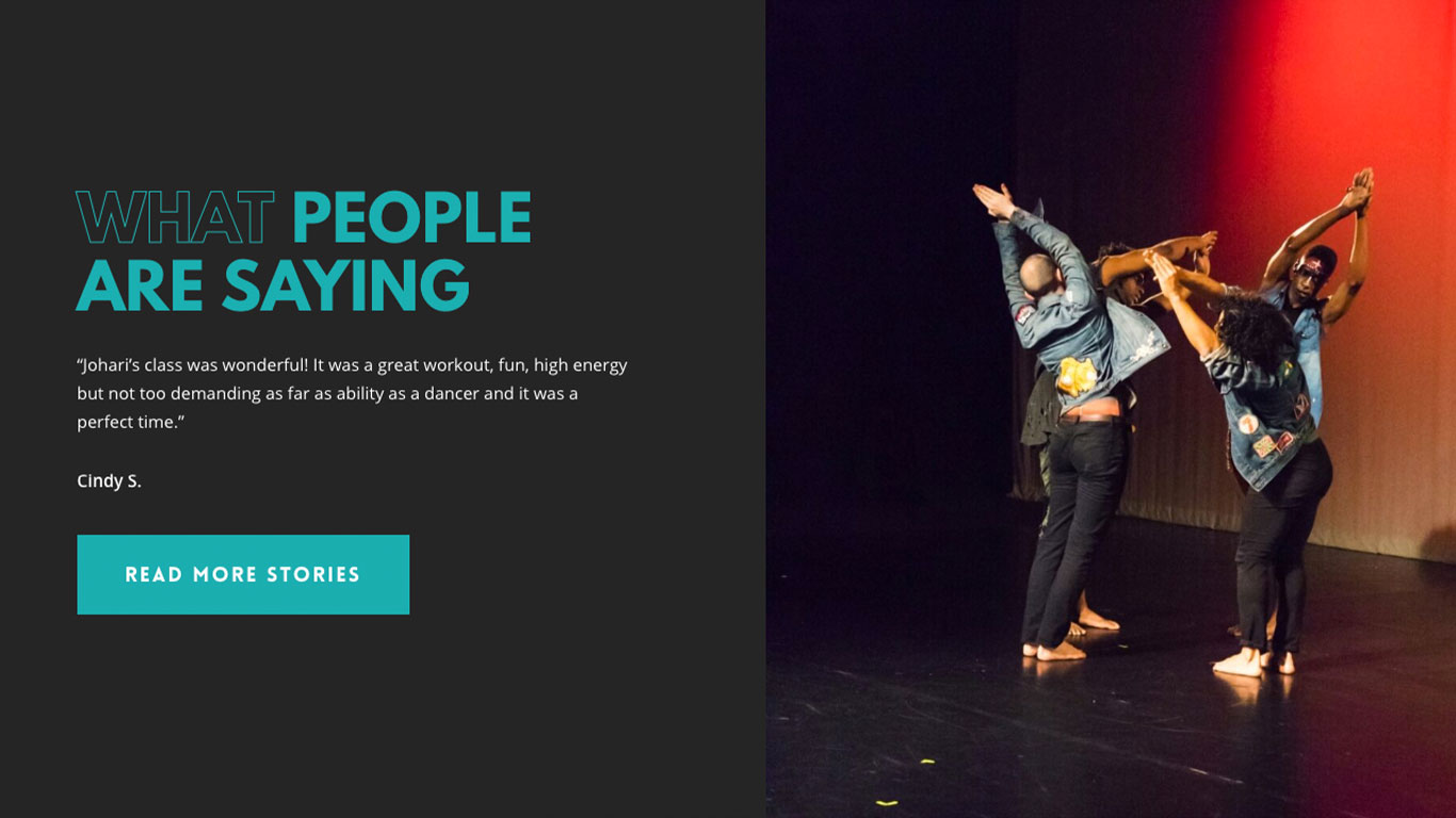
They knew they weren’t putting their best foot forward since their website that honored the beauty and healing power of dance didn’t have nearly enough of their own photos. We added more visuals of dancers and instructors, as well as information about the organization. We also suggested adding metrics about work they have already done. This provided validation to an organization that clearly deserved it.
COMMUNITY
Before | After
CONNECTION
Before | After
Francis Ouimet Scholarship Fund
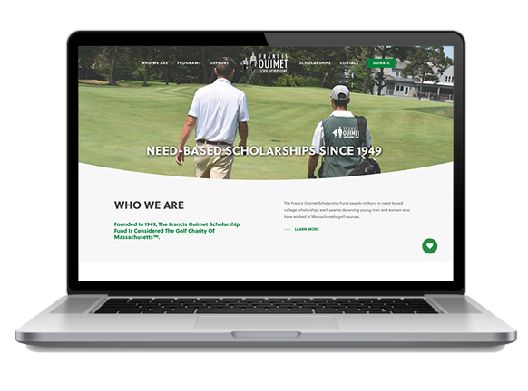
The Francis Ouimet Scholarship Fund was founded in 1949 to provide millions in need-based college scholarships to young people who have worked at golf courses in Massachusetts.
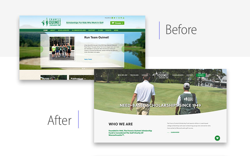
Before:
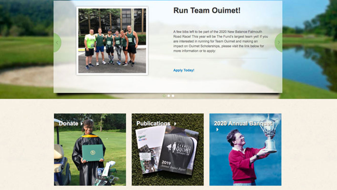
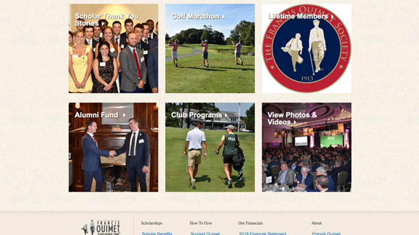
Sometimes a website that’s been around a while just gets messy. The look is outdated. There are too many redirects. It’s not mobile-friendly. And even the content and hierarchy has changed. Instead of trying to edit a website into something totally different, it is more efficient to do a nonprofit website redesign.
After:
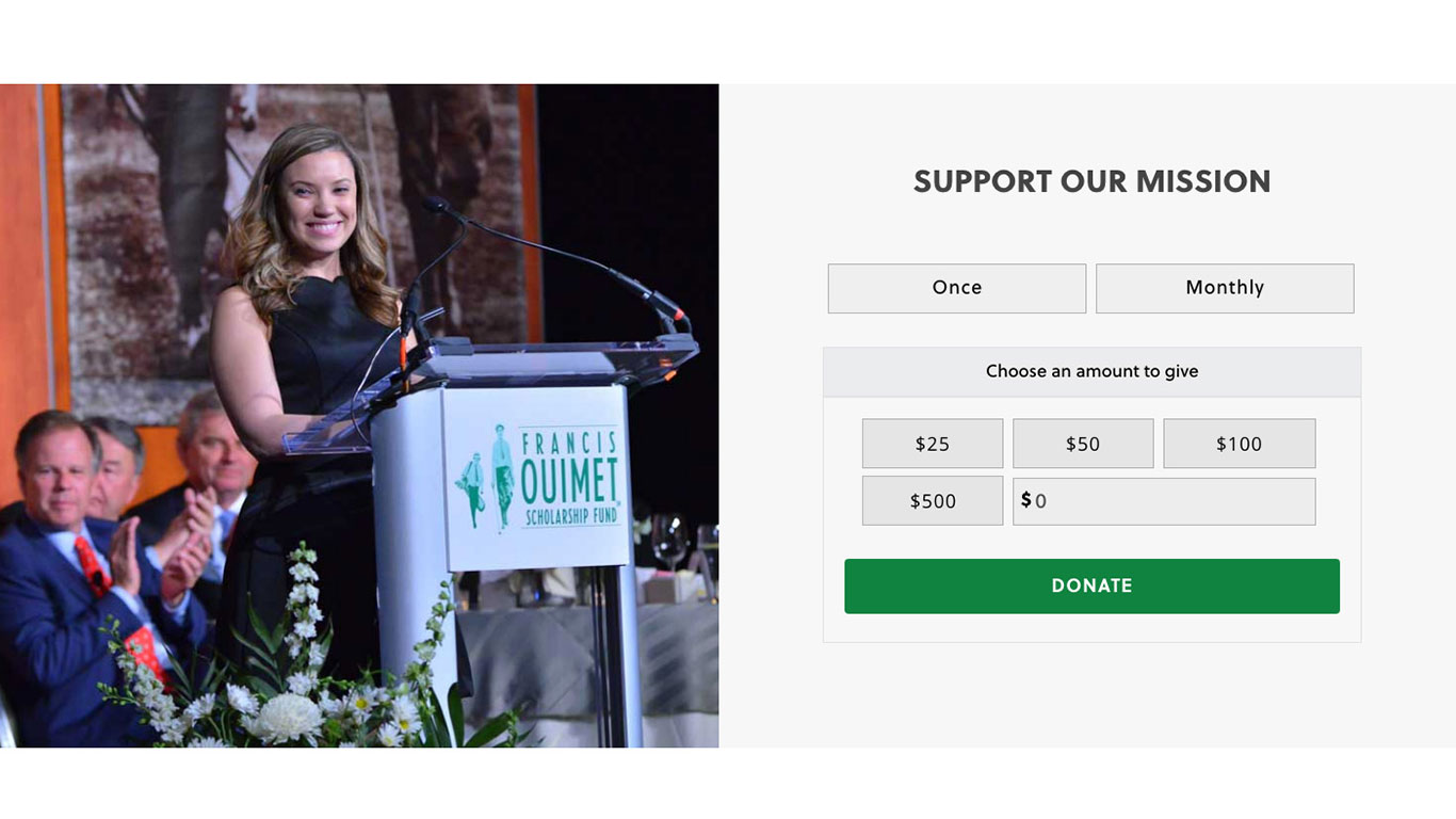
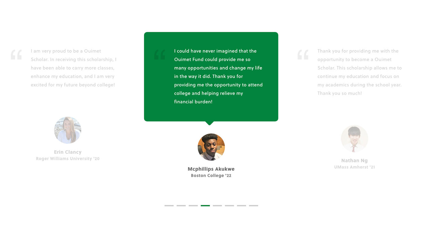
The redesigned Francis Ouimet Scholarship Fund website had a fresh, new look that matched the professional tone of the organization without sacrificing personality. They were able to broaden their reach, engage existing donors and welcome many new donors.
DONATE
Before | After
TESTIMONIALS
Before | After
We Are Gen Z
We Are Gen Z is a platform created to cultivate the next generation of journalists and give them the ability to brand their name, content and social media.
Before:
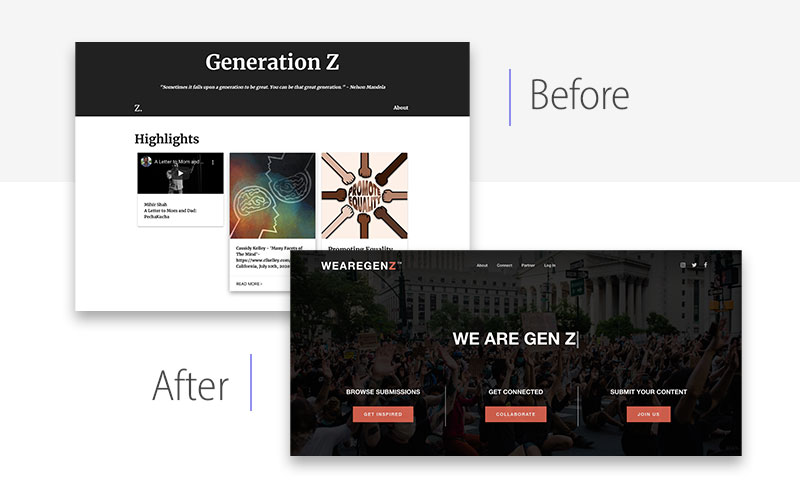
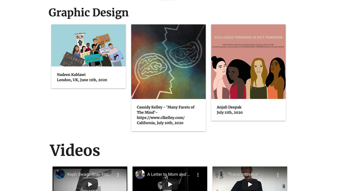
Their mission is powerful. Creative. Ambitious. Engaging. Exciting. Their website was… not. We Are Gen Z knew they wanted people to look at their site and know exactly what it was – a place of like-minded activists to connect – and they knew they needed professional UI/UX help to make that happen.
After:
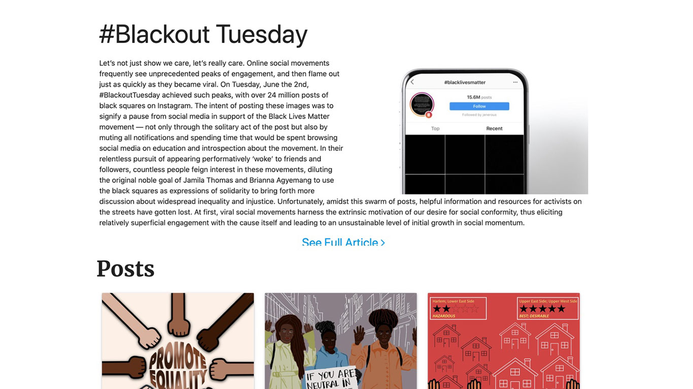
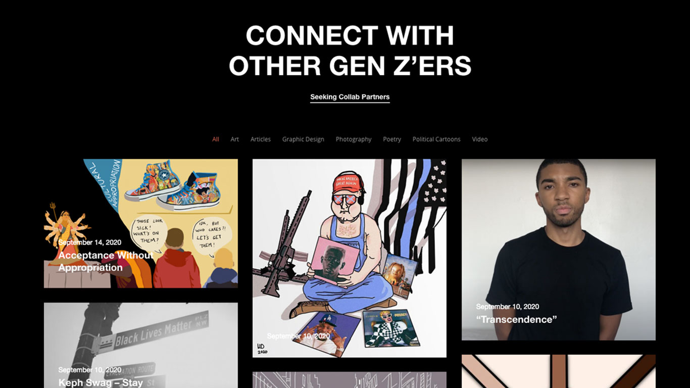
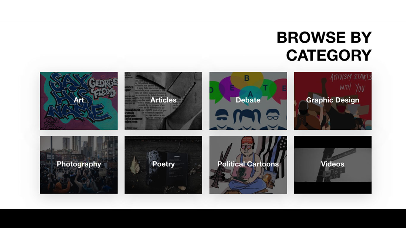
This project didn’t just create a website. It created a community and sense of urgency. We began by working with We Are Gen Z to build their brand recognition. The color scheme, styling and character carries through from their website to their social media to any other digital presence they have. Since their goals included a place for collaboration and creation and building partnerships, it was essential to have (dare I even say it?) synergy.
CONNECTIONS
Before | After
CATEGORIES
Before | After
What's Next?
Nonprofit website UX/UI is constantly evolving. Whether it is new design trends or the every-changing rules of SEO, any website that isn’t maintained is going to quickly become obsolete. But a nonprofit website redesign can improve SEO, conversion rates and credibility.
If you’re questioning whether or not your site is up to speed, there is a good chance at least a few elements could use some tweaking. Mittun is the premier website provider for nonprofits and can prevent your site from getting dusty.


